Palette Cleanser
June 1, 2026
Three years ago the sad beige trend peaked, driven by the quiet luxury market and I'd argue everyone's inability refusal to be asked to make a decision. Turning your office into a spa in the hopes that a controlled environment will soften the notifications from HR Karen is absolutely a strategy. There is a lane for this monochromatic, neutral-first, mid-cent approach. In many instances I happily coast in this lane at a chill 40mph.
In 2026 as the marketing industry turns increasingly towards tech, there is an almost comfortable herd mentality to further lean into this sameness. The thought leaders are tired, the algorithm holds the keys anyway, so what's wrong with flattening your brand's color palette to make it more digestible to the masses?
The problem we're seeing is that the beige sameness that once felt safe and even expensive now feels just feels unconsidered.
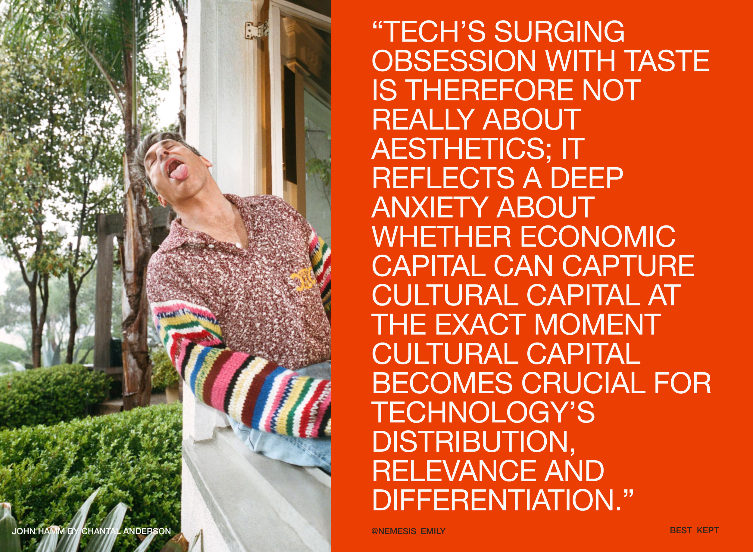
“A.I. is a force multiplier of mediocrity,” says Max Ottignon of Ragged Edge, the studio that branded Granola, the AI Notetaker. The “human-made” quality of Granola's logo including the chartreuse green of the brand, swings the pendulum to craft—signaling trust, effort, worth. Those in-the-know, those with any taste, can appreciate this strategic and culturally-aware brand choice. It's certainly the opposite of beige.
I invite you to chew on this quote by Emily Segal who coined the term Tasteslop:
Okay, so where does that leave us? We're too tired to make a bold color choice, but we don't want to atrophy into an oatmeal greige world.
Well, I won't try to convince you to flood your room in cerulean blue, but I will give you permission to use a little bit more in your branding. 81% of people remember a brand's color, while only 43% remember its name. Consumers make a subconscious judgement about a product within 90 seconds, and up to 90% of that assessment is based on color alone.
Take everyone's favorite brand transformation darling, Poppi. We could talk about how they used a variety of colors to dominate the soda market and lead with brand (vibrant pattern) rather than benefit (gut-health). But more interesting to me is how they took the color system beyond the guidelines, the packaging, the instagram feed, and applied it to redefining and owning the brand experience. Your life on Poppi is simply better—rose-colored glasses, one might say.
In the iconic 2025 Superbowl spot, that system thinking rooted in color illustrates the life you could be living by making the right choices. It shows up in the set design, the script, the wardrobe. There's colorful, vibrant Poppi life on the left, and dull, two-color bland life on the right.
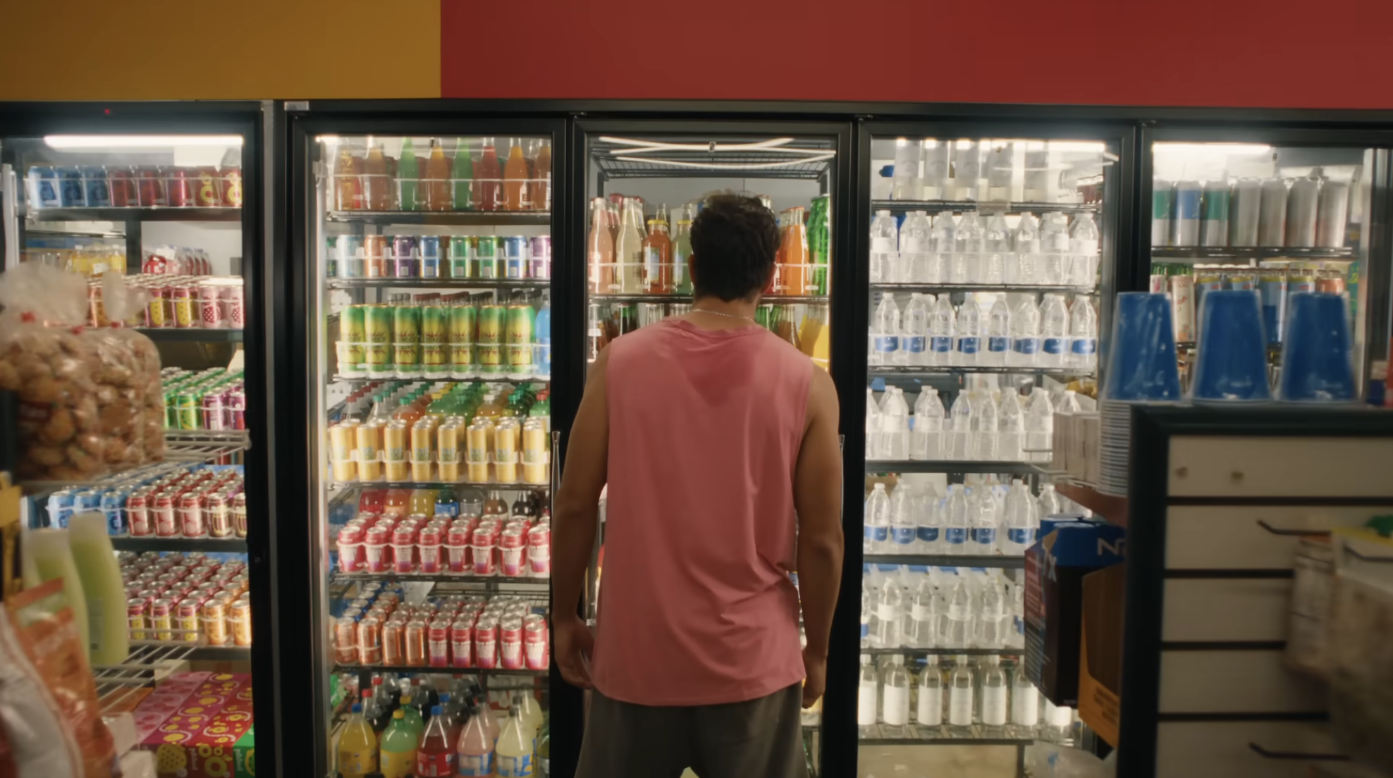
One month after they ran the ad Poppi sold to PepsiCo for $2B. This year the brand refreshed the vibes, but kept the color-is-lyfe message because it still works.
One of my favorite artists to follow for this creative intelligence is Bri Emery. I found Bri a few lifetimes ago when I was an Art Director at Lucky Magazine working on the first-ever “blogger” conference. CAN YOU IMAGINE? We had no idea. Bri had a blog called Designlovefest then and now has a site called Art Ball. If you're feeling stuck or just need a break, check out this mental massage exercise she created called Do the Dots, born from her love of color and mind-body healing.
Color is sensory, people. It's the fastest shortcut to feeling something, experiencing a brand. More universal than copy, more immediate than a logo, boosting an add-to-cart rate by 33%. Feeling is what makes someone remember you, trust you, choose you.
In our machine-generated and algorithm-sorted landscape, a brand needs to do more than just look like everyone else. They need to feel different. They need to offer a different, better experience.
So consider this your permission to live a little. You don't need to paint the walls neon. But maybe you consider adding some pops into the linen palette, a stripe to the color block. It's summer afterall.
Further Reading
Life Lessons with John Hamm, Mr. Porter
A Lo-Fi Rebellion Against A.I., Kyle Chayka for The New Yorker
AUNTWAVE: a funky, love-filled trend for crazy-making times, Blackbird Spyplane
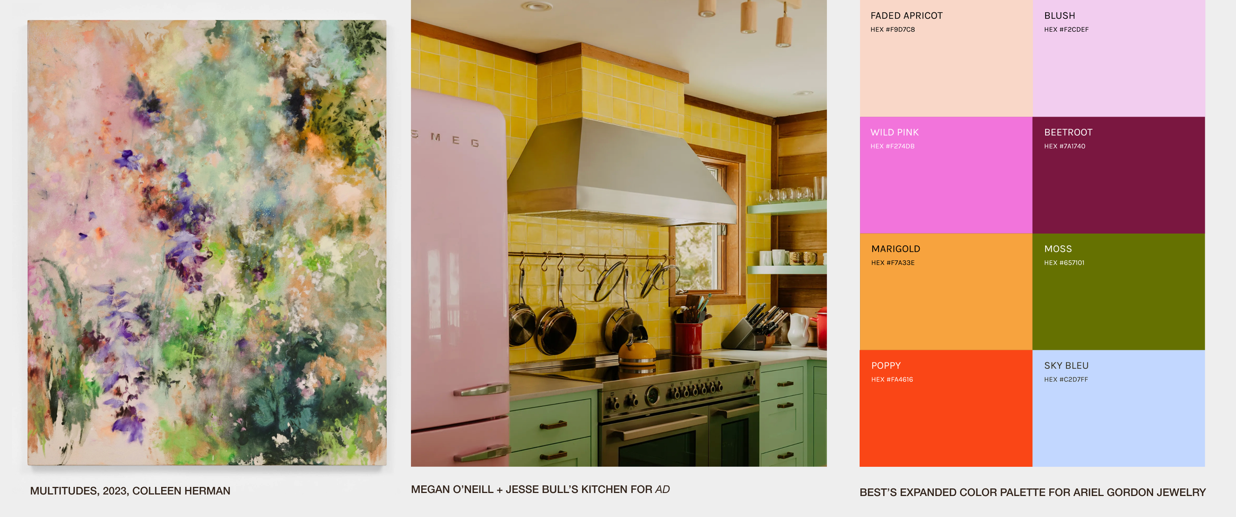
Yellow Tile, Green Cabinets, and a Pink Fridge Set the Tone for a Family's Woodstock, New York, Home, Architectural Digest